
Colors can elicit feelings, cause certain reactions, or covertly convey a message. When choosing a specific hue or shade for their work, artists must take into account if the colour scheme fits the tone they intend to achieve. Artists and designers can maximise the impact of their creative work by making the best decisions based on their knowledge of how colours interact. Sometimes, they prefer using tertiary colours over primary and secondary colors.

Due to the fact that they are compounds, primary and secondary colours are combined to create tertiary or intermediate hues. One can blend colours to create hues like blue-green, blue-violet, red-orange, red-violet, yellow-orange, and yellow-green. Tertiary colours are situated between primary and secondary colours on a colour wheel. In contrast, secondary colours are significant in art and design. It’s important to realise that media has an impact. There is a single set of primary colours that the majority of us are familiar with when discussing pigments. They are the source of secondary colors.
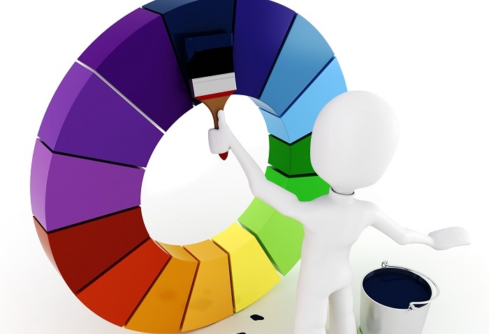
These colour combinations were made by mixing the two primary colours in equal amounts. Secondary colours are situated between main colours on the colour wheel. According to the traditional colour wheel, red and yellow make orange, blue and purple make purple, and yellow and blue make green. There are additional secondary colours known as additives that can be used with an RGB colour wheel. Blue and green produce cyan, blue and red produce magenta, and blue and yellow produce green.
Tertiary colours are intermediate hues created by combining a neighbouring secondary colour on the colour wheel with an equal amount of a main color. There are six tertiary colours: red-orange, yellow-orange, red-purple, blue-purple, yellow-green, and blue-green. There are three primary colours: red, yellow, and blue; three secondary colours (created by combining two primaries in equal concentrations); green, orange, and purple. It is customary to include a hyphen to differentiate the primary colour from the secondary colour when naming tertiary colours.
Orange, green, and purple are the three secondary colours that are created by combining any two of the three main colors. One must combine the two primary colours that are next to one another on the colour wheel to create these three hues. The three fundamental colours serve as the foundation for all secondary colours. Two main colours are combined to produce secondary colours. Blue and yellow are mixed to create green in the world of art, where pigments constitute the medium. Purple is created when red and blue are mixed.

Red and yellow combine to form orange. In this instance, the secondary hues are green, purple, and orange. As a general rule, blend the basic colours in equal amounts when mixing secondary hues. By doing this, a pure colour is produced, which can then be modified using white, black, and grey. It should be noted that the three primary colours used in Sir Isaac Newton’s colour wheel were red, yellow, and blue. His theory influenced the creation of the colour wheels we have today, which decorators and designers use to create colour schemes. When you consider that different paint colours are created through pigmentation, this makes sense. The three pigments that make up red, yellow, and blue (RYB) are the three primary colours from which all other colours are made.
The process through which secondary colours are produced is another intriguing feature. They are produced by adding or taking away. Once more, a lot of this depends on the media you are using. The third primary colour is really eliminated when two primary colours are mixed to make a secondary colour. Everything here is based on how the human eye perceives colour. In light of this, mixing yellow and blue pigments results in the creation of green and the removal of red by, in a sense, filtering out the red part of the spectrum. The secondary colour would lean more toward black than any other colour if the red were left unaltered.
Tertiary colours are intermediate hues created by combining a neighbouring secondary colour on the colour wheel with an equal amount of a main color. Equal parts of a primary colour and a secondary colour are combined to create a tertiary colour. Six tertiary colours are available. On the colour wheel, they are located halfway between the primary and secondary colours from which they are mixed.

Let's see what colours we get after combining the secondary colours orange, green, and purple, since we know that tertiary colours are created by doing so. One advantage of comprehending the meaning of tertiary colours is being able to produce a complex colour like burnt sienna. The fact that tertiary colours are not extremely brilliant is one thing that stands out in particular. They all have a greyish green colour. As a result, mixing purple and green won’t produce pure blue, for instance. So, the three tertiary hues are burned sienna, olive green, and blue-gray.
There is no rule that says you have to stick to a 1:1 ratio, but these are the results of an equal mixture of secondary colors. It will either be a green-gray that appears teal or a greyish purple that appears violet, depending on how the colours are mixed. The following are the colours we get after combining the secondary colours orange, green, and purple, as we know that tertiary colours are created by doing so.
When orange and yellow combine, they form yellow-orange (also known as amber). To create red-orange, combine red and orange (this may be referred to as vermillion), To create red-purple, combine purple and red (this may also be referred to as magenta), To create blue-purple, combine blue and purple (this may also be referred to as violet), Green and blue combine to create blue-green (also known as turquoise or teal), while yellow and green combine to create yellow-green (this may also be referred to as chartreuse or spring green).
Color has a universal appeal. In our daily lives, colour is crucial. For everyone, colour is a source of joy. Colors have the power to affect people’s emotions, lower or raise tensions, stir up excitement, and sometimes even have a calming effect on the weary. Everyone should make an effort to surround themselves with lovely secondary and tertiary colours on a daily basis. Applying colour to one’s life allows one to access its value.